

One of the latest Divi updates introduced the craziest ways to create backgrounds with Divi. Among other things it is now possible to display gradients – so called gradient backgrounds – very easily. I love gradients and I find them even cooler when they are animated. In this tutorial I will show you how you can easily create animated backgrounds on your website.
Convert animated gradient backgrounds with CSS
We could make it elaborate now and write the code ourselves, but why should we, when there is a wonderful generator for it?
Guide: Animated background with Divi
Step 1: Open the page https://www.gradient-animator.com
Step 2: Use the green button + Add Colour to add at least two colours and keep the window open as we need the generated code right away.
Step 3: Now create the module where you want to use the animated gradient or open an already created module.
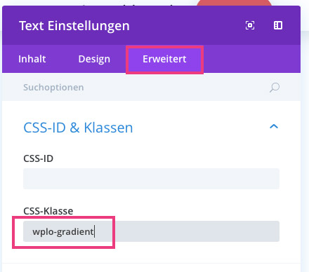
Step 4: Under the tab Advanced, you now enter the CSS class wplo-gradient>/code>. Afterwards you can leave the module again.
Step 5: Now go to the Custom CSS field or wherever you embed your CSS code and add the following code:
.wplo-gradient{
}
If you’ve never had anything to do with CSS before, I recommend you to visit our Divi CSS Tutorial first.
Step 6: Now you should put all your concentration together, because it will be a bit tricky! Go back to the Gradient Generator and copy the first part of your code and paste it between the curly brackets (see step 5) The second part of the code from the Gradient Generator, paste it behind the closing parenthesis of our code. The whole code should now look like our code:
.wplo-gradient{
background: linear-gradient(270deg, #dd5a5c, #f0e555);
background-size: 400% 400%;
-webkit-animation: AnimationName 30s ease infinite;
-moz-animation: AnimationName 30s ease infinite;
animation: AnimationName 30s ease infinite;
}
@-webkit-keyframes AnimationName {
0%{background-position:0% 50%}
50%{background-position:100% 50%}
100%{background-position:0% 50%}
}
@-moz-keyframes AnimationName {
0%{background-position:0% 50%}
50%{background-position:100% 50%}
100%{background-position:0% 50%}
}
@keyframes AnimationName {
0%{background-position:0% 50%}
50%{background-position:100% 50%}
100%{background-position:0% 50%}
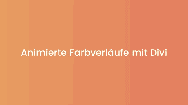
}Step 7: Now just save and the animated gradient should look like our example.

Comments