

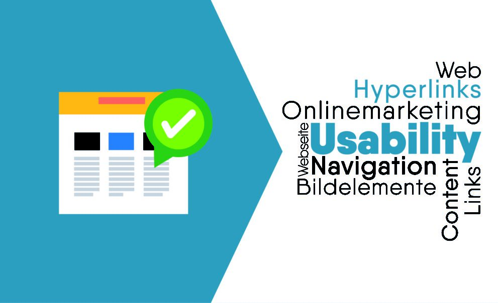
Good usability for (external) links
Hyperlinks enable us to navigate the Internet. The better a link is enhanced with metadata, the easier and more comfortable navigation becomes for the user. In doing so, I differentiate between the possibilities of design and specification in duty and free skating. Let’s start with what good usability must be considered when creating a link.
Creating hyperlinks (mandatory)
1. designation (contents)
The linked text must be meaningful (self-descriptive), which applies equally to content links and button links. It can therefore be useful to reformulate a sentence so that a relevant part of the text can be linked well.
The user should always be able to see what content he can expect on a linked page. It is easier to grasp this if the link itself gives an indication of the type of linked content.
Example for a content link
You will find our general terms and conditions here
Read more about … in our General terms and conditions of business (AGB).
2. visual representation
The appearance of references should be clear and consistent. The really important thing is that all users are able to recognize the clickable elements. So you have to make a clear difference between links and regular text. This can be done with color, underline, border, background color and other visual features. Visual impairments should be in the back of the mind when designing.
Most users have learned that clickable text is underlined. Therefore it is a good idea to underline content links. For navigations that exist as separate self-contained modules on websites, I don’t consider this necessary.
Once a style has been chosen, it should be used consistently and without exception throughout the entire website. I also recommend to use all available states for links, or to overwrite them properly.
| Zustand | Beschreibung |
|---|---|
| a:visited | Dieser Link wurde vom Benutzer schon einmal besucht. |
| a:hover, a:focus | Dieser Link ist gerade vom Benutzer per Maus oder Tastatur angewählt. |
| a:active | Dieser Link wird gerade vom Benutzer aufgerufen. |
It is important to consider this order when creating the CSS rules, otherwise they will overwrite each other override.
SCSS example
a {
  color: blue;

  &:visited {
    color: grey;
  }

  &:hover,
  &:focus {
    text-decoration: none;
  }

  &:active {
    color: red;
  }
}
If you use button styles that can also be applied to anchor elements, you have to adapt these states in the button class accordingly, because the element rules also apply there. On ADFREAK.DE, for example, I use the class .btn-primary for the primary button. The SCSS for this looks like this:
.btn-primary {
  ...
  color: #fff;

  &:visited {
    color: #fff;
  }

  &:hover,
  &:focus{
    ...
  }

  &:active{
    ...
    color: #fff;
  }
}
In addition to the font color, the background color, border color and inner shadow are adjusted, but this is not relevant for this example. It is important that the default color of visited and active is overwritten here, so that the visited link is not gray and the active link is not red. This is fine, since the buttons usually trigger an action and are used less often for navigation.
For example, if buttons are used as navigation elements in an order process, it would not be helpful for the user to indicate that he has already gone Next or Back. This task is performed by a process tracker in this context.
e.g;
Optimizing hyperlinks (freestyle)
1. mark external hyperlink
As a rule, the user expects to move within the same website when clicking on an ordinary link. If links are inserted that refer to external sources, this is indicated to the user so that he is informed of the context change before the click.
Several symbols/icons can be used for this. I recommend an arrow that points upwards in some way. In the Unicode character set, there are many different characters in arrow look that could be used.
a {
  &[href^="http"]{
    &:before {
      content: "\2197\0020";
      white-space: nowrap;
    }
  }
}
In this example I use the hexadecimal version of the Unicode character NORTH EAST ARROW: 2197, and the character 0020 is the hex notation of the space character.
However, the different operating systems on PC, Mac and mobile devices most likely display the arrows not consistent or cannot display all arrows at all (depending on the default font). On current iOS devices, the arrow used above is converted into a graphical emoji, for example, which you usually don’t want.
If you need a consistent look, the icon should be created with a graphic (SVG) or an icon font.
The use of a graphic is suboptimal if the icon is to be colored in the hover, visited or active state. Since background SVGs cannot be colorized, the icon would have to be available in the required colors, which leads to a rather complex maintenance.
A web font for icons does not have these disadvantages and would be optimal in this use case, since the icon can be placed in the text flow. However, I would not want to load an additional web font for a single icon. So if you can find useful uses for the font in other parts of the website, this would be my tool of choice.
Problem 1 – Absolute internal links
The previous SCSS code works, but also works for absolute internal links. These are often generated by WordPress, for example. This can be solved by adding another attribute selector to the selector and filtering out links to the domain of the website.
a {
  &[href^="http"]{
    &:not([href*="designerzone.de"]) {
      &:before {
        content: "\2197\0020";
        white-space: nowrap;
      }
    }
  }
}
The negation :not() selects only links that start with “http” and do not contain the domain “designerzone.de”.
Problem 2 – Linked images
If images are provided with external links, the selector also takes hold here and creates the corresponding icon. But we do not want to display this hint on the image, because in most cases this looks strange or even faulty.
By convention, you can assign the link the class image-link and extend the selector with another negation.
a {
  &[href^="http"]{
    &:not([href*="designerzone.de"]) {
      &:not([class="image-link"]) {
        &:before {
          content: "\2197\0020";
          white-space: nowrap;
        }
      }
    }
  }
}
2. Show language of the hyperlink
Perfect is the link labeling with the language of the removed content, if it is different from the language of the website.
At anchors, the attribute hreflang is intended for exactly this purpose. It contains the ISO code of the language – if necessary supplemented by the region (examples: es, it, en-GB, en-US). For the browser, it only represents a Note, but we web developers can use it to provide useful support for the user. Let’s extend our existing code.
a {
  &[href^="http"]{
    &:not([href*="designerzone.de"]) {
      &:not([class="image-link"]) {
        &:before {
          content: "\2197\0020";
          white-space: nowrap;
        }
      }
    }
  }

  &[hreflang^="en"]{
    &:after {
      content: "\0020(Englisch)";
    }
  }
}
Since we use the before pseudo element for the arrow, the after pseudo element is left for the language specification. In reality, I planned it that way, because I like to write the language in brackets behind the link. But abbreviations would also be possible. Instead of the texts, you could also use a background graphic (preferably SVG) for the marking, e.g. a small national flag.
Summary
Such banal elements as links also require care. If you use CSS selectors cleverly here, you can increase the usability for the users with simple means. Ultimately, a precise marking of the links can also ensure that users do not immediately move on. By marking the link type and language, the user can judge much better whether the link will take him to his desired destination.

Comments