


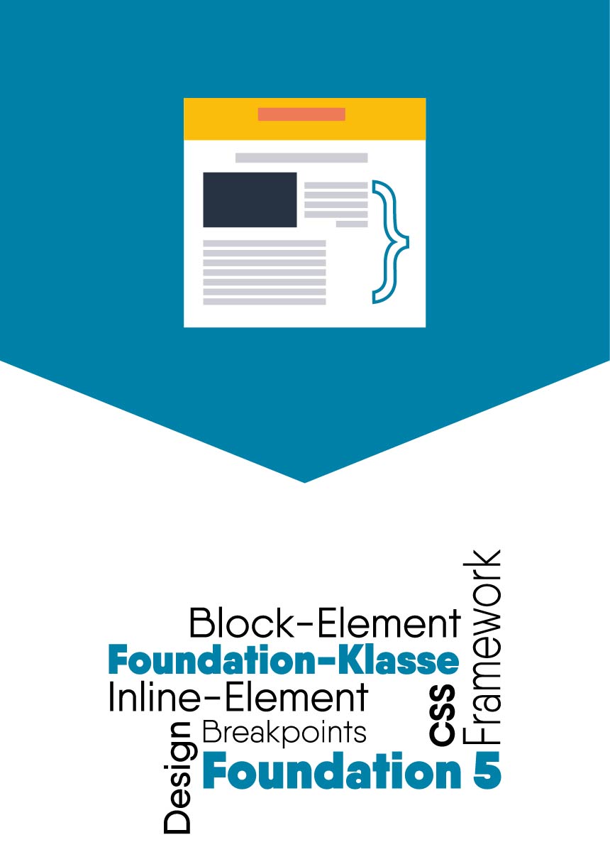
In the frontend framework Foundation, the existing visibility classes are often quite helpful to show and hide elements at the breakpoints. While working with them, I came across a case where the concept does not work.
There may be situations where you want to hide part of a static text at certain breakpoints. Let’s assume the following code:
Das Produkt ist super toll und hat extrem viele gute Eigenschaften, die wir hier gerne alle aufzählen wollen ...!
The show-for-large-up class is defined in Foundation 5 as follows:
@media only screen {
  .show-for-large-up {
    display: none !important;
  }
}
...
@media only screen and (min-width: 64.063em) {
  .show-for-large-up {
    display: inherit !important;
  }
}
Instead of setting the display property for fading in at this breakpoint to block, the visibility class sets it to inherit. The !important, which is actually known as a bad habit, is added so that this rule applies in any case, since the class definition may not be specific enough. inherit means that the element should inherit the value of the display property.
In this case, this is a paragraph tag, which by default is a block element and therefore this element will inherit the display: block; property to the inner span. For this reason, the text is “blown up”.
e.g;
Example
The product is super great and has extremely many good qualities, which we would like to list here …!
This is not the desired result in this case, because the text should actually continue to be in the text flow (inline).
Solutions
If you encounter this problem, there are several possible solutions:
1. own Foundation-like class
One could refrain from using the Foundation class in favor of one of one’s own, which would then obtain the desired behavior.
@media only screen and (min-width: 64.063em) {
  .inline-for-large-up {
    display: inline !important;
  }
}
2. Imitate class behaviour in the existing CSS structure
Considering the example above, we only have the following selector to style the span: p > span. The media query could then be within the rule. The example is SCSS code.
p > span {
   display: none;

  @media #{$large-up} {
      display: inline;
  }
}
I use the standard variable $large-up from Foundation in the media query definition to access the breakpoint settings from the defaults or settings.


Comments